The contemporary design emphasizes minimalism and simplicity. When it comes specifically to logo design, it's taking an abstract and minimal approach that is becoming more common, probably due to its unique nature. A minimal logo can achieve a lot with a small amount of collateral. In “Minimal logo = better?”, we take a close look at the wave of minimalism in logo design and give you some insights to inspire you.
Minimalism is not a trend. It's a perpetual visual discipline that has influenced every aspect of culture, including art, architecture, graphic design, and other industries. This form of expression comes from an overly ornate or an expressive visual trend, which often brings this form of restraint to light as a reaction to times of social flux.
Its roots date back to before the 1960s in Japanese architectural philosophy called MA. Also called “the gap between”, it celebrates the space between two things - it's about the negative space, voids, emptiness. Over time, MA's influence spread beyond Japanese architecture and culture, emerging in the world of graphic design.
“Logos are incredibly significant to brands.”
If you haven't noticed, minimalism is all about “less is more”. It emphasizes simplicity and existing elements in graphic design. In other words, it's about having the restraint to eliminate anything that distracts the viewer from the message, memorability, or recognition. This is the whole point of minimal logo design.
Logos are incredibly significant to brands. First impressions matter, and it's the first thing we see when we contact a brand. A minimal logo that works well is the one that plays on the way our brain works. Instead of recognizing complex illustrations, our senses simplify images to store them in memory.
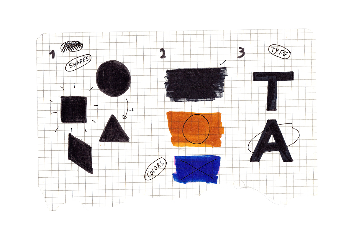
So this leaves the question: “What makes a minimal logo different from other logo designs?”. We love minimalism in all its forms, preferably minimal logo design. To help, we’ve put together three of our favorite features about designing minimal logos: Simple shapes, single colors, and bold typography.
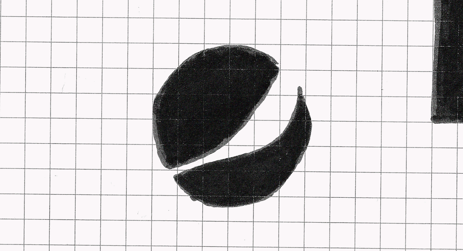
- Yes, get back to basics with shapes and geometric shapes. Minimalist logos often incorporate organic shapes that look natural in appearance. Quite often, it's how the shapes interact with one another that becomes the focal point of the design.
- Sticking with clean, uncluttered color. The key to a minimal logo is black and white. A minimal logo starts with these colors, reads black and white, and after that, other colors can be applied in other elements.
- The usage of daring typography. This is crucial since a minimal logo favors heavy, bold, and slim fonts supported by lowercase letters. The sleek, modern look of both styles is ideal for this approach.
As vivid and loud as the world is, it's actually the simple things that make us stand up and notice. However, the design has to match the brand and the message to convey. When everything is aligned, the benefits for the brand are incredibly overwhelming. A minimal logo will make us look twice. The colors and shapes will grab your attention and stand out, even on smaller mobile screens. And most important, it sets your brand apart from the rest, making it easy to be recognizable.
"Be patient, creative, and work with a purpose."
The minimalistic aesthetic is timeless. In addition, it's remarkably versatile, and no matter what style is in vogue, a simple logo will almost certainly work in a design - that's why Nike has kept the same swoosh mark for decades!
A minimal logo is easy to remember and understand at a glance, which can be translated as beneficial for a brand and its communication. But logo design can be tricky. You can get it in a flash, or it can take years to perfect. So, be patient, creative, and work with a purpose. And you will find that perfect mark. (Just make sure to have fun on the way.)